Bold and Beautiful: Using Color Trends in Granger, IN Kitchen Remodeling
Kitchens around Granger are starting to show a lot more personality these days. After years of sticking with predictable whites and neutrals, many homeowners are ready for something that feels fresher and more reflective of how they actually live in their space. It’s a shift you can see just by walking through the neighborhood or browsing local remodel photos online.
A big part of that change comes from color. Homes built in the late 90s and early 2000s often have solid layouts but finishes that now feel dated or overly busy. A thoughtfully chosen palette can brighten darker corners, soften older wood tones, or simply make your kitchen feel more welcoming the moment you walk in.
In this guide, we’ll look at the color trends showing up most in Granger kitchens and how to use them confidently. Think of it as a relaxed conversation about what actually works in real homes, not just what’s trending online, and how color can bring new life to your own space.
Why Color Matters in Today’s Granger Kitchens
If you’ve lived in Granger for a while, you’ve probably seen the wave of kitchen updates happening around the neighborhood. Someone updates their cabinets, another adds a bold island, and suddenly your own space starts to feel a little dated.
Color is often the easiest and most rewarding place to begin. A new palette can brighten a shadowed corner, soften heavy wood tones, and make a 20-year-old layout feel surprisingly fresh. It’s a simple change that sets the tone for the entire remodel.
Many kitchens in the area still have their original finishes from the early 2000s, so even subtle color updates can make the room feel completely different.
Today’s Top Kitchen Color Trends
Here’s a quick look at the colors homeowners in Granger are gravitating toward right now. These choices tend to work especially well with the natural light and layouts typical in local homes.
Popular choices include:
- Warm neutrals: like creamy whites, mushroom tones, warm grays, and soft putty
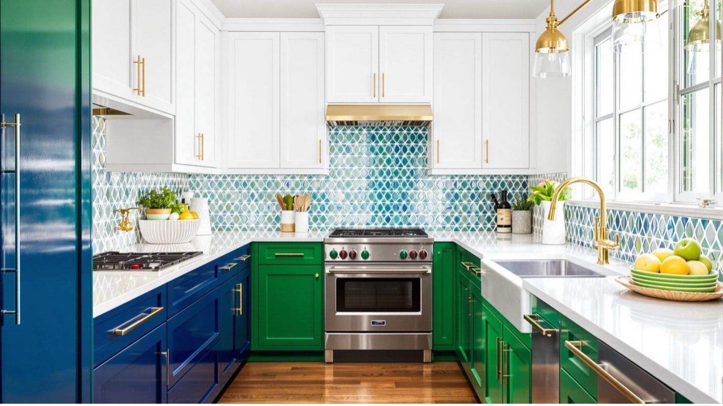
- Bold, moody colors: including deep green, navy, charcoal, and smoky blue
- Nature-inspired hues: such as soft greens, clay tones, and sandy earth colors
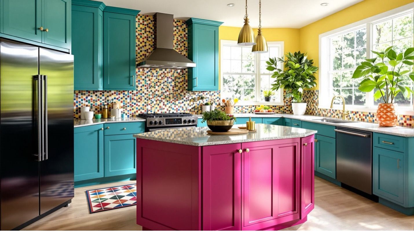
- Two-tone combinations: where the island becomes the standout piece
- Soft blacks:
used sparingly to add depth without overpowering the space
What makes these colors so appealing is their staying power. They feel current without feeling risky, and they adapt well to both open-concept and traditional Granger homes.
Bringing Bold Color Into Your Kitchen Cabinets
Cabinets take up the most visual space in a kitchen, so they’re usually where color makes the biggest impact. If you’re planning to update your kitchen cabinets, exploring color early helps the rest of the design fall naturally into place.
Bold tones like navy, forest green, charcoal, and rich taupe continue to grow in popularity. They’re strong and stylish without being flashy. If your kitchen gets a lot of natural light, these deeper tones can look incredible. If the room feels a bit tight or shaded, a warm neutral might be the better approach.
Here’s a simple way to think about it:
- Use color where it feels natural to draw attention: Islands, range hoods, and accent cabinetry look great with bold shades.
- Keep the main cabinet run lighter: if you want a bright, airy feel.
- Flip the formula:
if you want the perimeter to feel grounded and the island to pop.
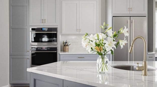
Countertops and Backsplashes: Creating a Balanced Palette
Once you land on a cabinet color, everything else gets easier. The countertop and backsplash bring the palette together and help the room feel cohesive.
Choosing Countertops That Work With Bold Colors
If you pick strong cabinet colors like navy or deep green, lighter quartz with subtle veining usually draws the eye upward and keeps the kitchen from feeling heavy. Warm taupe cabinets pair beautifully with creamy stone or quartz that leans a bit golden. Even a dark countertop can work well if your cabinets and lighting keep the room bright.
Where the Backsplash Fits In
A backsplash is a great place to add personality without going over the top. You’ve probably seen the classic subway tile around Granger homes, but many homeowners are moving toward glazed tiles, handmade-look edges, and soft patterns that give the room more texture.
How to Keep the Whole Look Balanced
Think of the kitchen as three key players: cabinets, countertops, backsplash. Let one be the star, one the supporting role, and one the neutral base. When each finish supports the next, the whole room feels thoughtfully put together.
Using Color to Improve Layout, Lighting, and Flow
Here’s where color becomes more than a style choice. It can genuinely change how your kitchen feels and functions.
If your kitchen is big and open, darker colors can help define the space and keep it from feeling too spread out. In smaller or older layouts common in Granger, lighter colors instantly brighten the room and make it feel more spacious.
Color can also guide how your eyes move through the space. A navy island becomes a natural focal point. Light uppers lift the ceiling. If your kitchen has an awkward corner or a tight transition area, the right color placement can help soften those visual bumps.
Quick ideas that work well in Granger homes:
- Lighter uppers paired with darker lowers for better balance
- A standout island in a bold color to create a centerpiece
- A warm neutral perimeter to brighten older cabinetry footprints
- Darker tones to anchor long, open-concept kitchen walls
These small choices help shape the flow of the room without major structural changes.
Using Trendy Colors Without Regret
Choosing color is exciting, but most homeowners want to feel confident the look will hold up over time. The good news is that bold color doesn’t have to feel risky.
A smart approach is to go bold in places that are easier to change and stay neutral in the spots you rely on every day. Islands, floating shelves, specialty cabinets, and accent walls are perfect for experimenting. The main cabinet runs or countertops often work best in timeless tones.
If you’re planning a larger update, especially one that involves layout changes or new surfaces, looking at the project from a kitchen remodeling perspective can help you think through color choices more clearly. Leatherman Supply works with Granger homeowners regularly, and the team understands the lighting quirks, layout challenges, and style preferences common in the area. They’ll walk you through colors that feel exciting now but still make sense long-term.
Conclusion
Color can completely change the way your kitchen feels. Whether you’re drawn to bold greens, warmer neutrals, or something in between, the right palette makes the space feel inviting, comfortable, and updated without losing the character of your home.
If you’re ready to start exploring colors and materials, stop by the showroom in Goshen. Seeing finishes side by side makes every choice easier, and the team is always happy to walk you through options at your own pace.